Вопрос:
Я узнал, что отображение flex помогает мне сократить время работы для публикации.
Однако у меня проблема, что макет не отображает то, что я хочу.
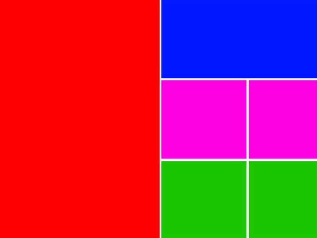
Все, что я хочу отобразить, как сетка, как показано ниже:
Но, к сожалению, я не могу решить эту проблему самостоятельно.
Не могли бы вы дать мне совет, как я могу исправить эту проблему с помощью flex tag?
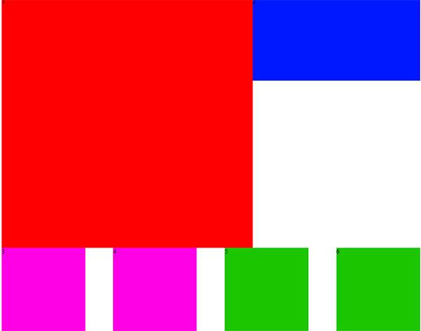
Вы также можете увидеть мою проблему, как показано ниже:
Вот мой код:
.item_wrap{ display: flex; justify-content:space-between; flex-flow:row wrap; } .item_0{width:500px; height:500px; background:#ff0;} .item_1{width:490px; height:160px; background:#00f;} .item_2{width:240px; height:160px; background:#ff00e4;} .item_3{width:240px; height:160px; background:#ff00e4;} .item_4{width:240px; height:160px; background:#1cc600;} .item_5{width:240px; height:160px; background:#1cc600;} Лучший ответ:
Вам нужно будет изменить структуру HTML.
Все блоки с правой стороны должны быть завернуты в <div>.
HTML:
<div class=»item-wrap»> <div class=»item_0″>0</div> <div class=»inner-wrap»> <div class=»item_1″>1</div> <div class=»item_2″>2</div> <div class=»item_3″>3</div> <div class=»item_4″>4</div> <div class=»item_5″>5</div> </div> </div>
CSS
.item-wrap { justify-content: space-between; display: flex; } .inner-wrap { justify-content: space-between; flex-wrap: wrap; display: flex; } .item_0, .inner-wrap { flex-basis: calc(50% — 5px); } .inner-wrap > div { flex-basis: calc(50% — 5px); } .inner-wrap > .item_1 { flex-basis: 100%; } * {box-sizing: border-box;} body { margin: 0; } .item-wrap { justify-content: space-between; height: 100vh; display: flex; } .inner-wrap { justify-content: space-between; flex-wrap: wrap; display: flex; } .item_0, .inner-wrap { flex-basis: calc(50% — 5px); } .inner-wrap > div { flex-basis: calc(50% — 5px); padding: 10px; } .inner-wrap > div + div { margin-top: 10px; } .inner-wrap > .item_1 { flex-basis: 100%; } .item_0{background:#ff0; padding: 10px;} .item_1{background:#00f;} .item_2{background:#ff00e4;} .item_3{background:#ff00e4;} .item_4{background:#1cc600;} .item_5{background:#1cc600;}<div class=»item-wrap»> <div class=»item_0″>0</div> <div class=»inner-wrap»> <div class=»item_1″>1</div> <div class=»item_2″>2</div> <div class=»item_3″>3</div> <div class=»item_4″>4</div> <div class=»item_5″>5</div> </div> </div>Ответ №1
Привет! Проверьте этот код
HTML5, CSS3
.item_wrap { width: 800px; display: flex; margin: 0 auto; } .item_0 { height: 500px; background: red; flex: 1; margin: 5px; } .item_1 { height: 500px; background: yellow; flex: 1; margin: 5px; } .headbar { } .head_column { height: 200px; background: green; flex: 1; } .headbar2 { display: flex; } .pinkone { background: #000; flex: 1; height: 150px; } .pinktwo { background: pink; flex: 1; height: 150px; } .headbar3 { display: flex; } .grayone { background: gray; flex: 1; height: 150px; } .graytwo { background: blue; flex: 1; height: 150px; }<div class=»item_wrap»> <div class=»item_0″></div> <div class=»item_1″> <div class=»headbar»> <div class=»head_column»></div> </div> <div class=»headbar2″> <div class=»pinkone»></div> <div class=»pinktwo»></div> </div> <div class=»headbar3″> <div class=»grayone»></div> <div class=»graytwo»></div> </div> </div> </div>
Кроме того, вы можете следить за каналом YouTube – LearnWebCode